A Critical UX Perspective on Apple’s Latest Design Shift
The new unveiling of Apple’s Liquid Glass is so polarising that we needed to write two introductions! Like it? Hate it? Choose how you want to start this article off.
Like it?
Apple has long been celebrated for its visionary design that continually redefines what technology can look like. From the evocative warmth of skeuomorphism to the refined minimalism of iOS 7, each evolution has been a milestone in the journey of digital interaction. With the unveiling of the “Liquid Glass” design at WWDC 2025, Apple fans have every reason to rejoice. This fresh approach revives the intuitive cues of the past while seamlessly integrating them into a modern, translucent aesthetic that promises to elevate our everyday experiences.
In this opinion piece, we explore how Apple’s new Liquid Glass design exemplifies the perfect blend of nostalgic inspiration and futuristic innovation. By reimagining familiar elements with a refined, glass-like quality, Apple not only pays homage to its design heritage but also sets the stage for more immersive, intuitive interfaces. For loyal Apple enthusiasts and forward-thinking designers alike, Liquid Glass stands as a proud declaration of progress, heralding a future where beauty, functionality, and user experience harmoniously converge.
Hate it?
Apple has once again chosen to parade its tired aesthetics under the guise of innovation. For years, the tech giant has irked designers and alienated users with its erratic design choices—from the clunky skeuomorphism of the past to the sterile minimalism of iOS 7. Now, with its unveiling of the so-called “Liquid Glass” design at WWDC 2025, Apple isn’t taking a bold step forward; it’s simply regurgitating a hollow, translucent facade that masks a host of serious usability failures and design missteps. What was once a celebrated nod to tangible, warm interfaces has degenerated into an overhyped, misleading trend that screams vanity and impracticality. In this opinion piece, we cut through Apple’s polished act and expose how the “Liquid Glass” experiment not only revives outdated skeuomorphic cliches but also sacrifices functional clarity in favor of empty visual spectacle. Whether you’ve been an ardent Apple follower or a long-time critic of its design dogma, prepare for a deep dive into why this latest update may finally force a long-overdue strip down of Apple’s bloated interface paradigm.
Reviving Skeuomorphism: Nostalgia or Regression?

Skeuomorphism noun Pronunciation: /ˌskjuː.əˈmɒr.fɪ.zəm/
Skeuomorphism is a design technique where digital elements imitate the look and feel of real-world objects. This means incorporating details like textures, shadows, and gradients to make interfaces appear more tangible and familiar.
Historically, Apple’s early interfaces showcased skeuomorphism, a design approach that borrowed visual cues from the real world, making digital objects feel familiar and tangible. For many users, this design language evoked warmth and intuitiveness. The revival of skeuomorphic elements through Liquid Glass, as noted in recent discussions and articles, is both nostalgic and alarming. On the one hand, the references to stained glass effects and material-like interfaces can be seen as a bold homage to a bygone era; on the other hand, this move represents a potential regression in usability.
In re-embracing skeuomorphism, Apple risks overcomplicating its interfaces. The delicate balance once achieved by early skeuomorphic designs is now muddied by excessive transparency, exaggerated reflections, and animations that, rather than guiding the user, can distract and even confuse. Instead of a subtle nod to tactile cues, the modern interpretation in Liquid Glass seems to sacrifice clarity for mere visual spectacle.
Aesthetic Appeal vs. Usability: The Double-Edged Sword
Apple’s Liquid Glass design is, at first glance, visually arresting. The idea of digital surfaces that shimmer, refract light, and almost seem to “breathe” carries a futuristic charm, one that resonates with designers who long for a more tangible, sensory-rich interface. Voices in the design community have lauded the design’s aesthetic potential, arguing that it evokes a sense of depth and interactivity rarely seen in today’s flat interface landscape. Proponents assert that it marks a revival of expressive, experiential software design that could redefine how content is consumed on the go.
However, the initial excitement is rapidly overshadowed by a cascade of usability issues. While the conceptual brilliance of Liquid Glass is undeniable, its execution seems fraught with compromises that undermine its core purpose: to facilitate a seamless user experience. The transparency and dynamic lighting effects, designed to evoke a modern material, frequently interfere with fundamental aspects of usability. For example, users have reported that elements such as notifications and menus often become hard to read as the underlying content conflicts with the translucent overlays. In some beta versions, light text on light backgrounds creates a frustrating reading experience, compromising not only aesthetics but also function.
The conflict between form and function is stark. Apple’s design ethos has long balanced beauty and utility, yet with Liquid Glass the scales appear tipped in favor of artistic expression at the expense of readability and overall usability.
The Reading Struggle: Legibility Issues in a Transparent World

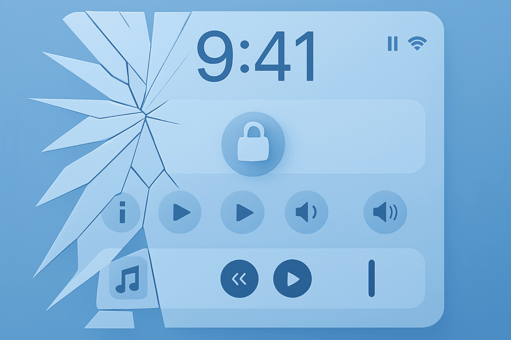
One of the most glaring UX pitfalls of the Liquid Glass design is its impact on legibility. Apple’s press materials have showcased interfaces where text appears on translucent surfaces, elements that, despite their delicate visual appeal, result in text that often “fades away” against bright backgrounds. This issue is not a mere aesthetic quibble; in practical terms, it can lead to significant accessibility challenges.
Consider the user experience when glancing at notifications on the lock screen. Early beta reviews and assessments indicate that the dynamic glass effect, meant to provide a seamless interaction between the foreground and background, ends up making critical information almost illegible. The control center’s overlay, for instance, exhibits too little background blur, allowing underlying icons to clash with interactive elements. Such design choices force users to squint or adjust settings unnaturally in scenarios where clarity is paramount.
This legibility issue is emblematic of a broader design flaw: prioritizing visual innovation over essential communication. When users must strain to decipher notifications or control panels, the resulting experience is inefficient and may induce cognitive overload, especially in contexts requiring quick interaction. For a design language that claims to enhance user comfort and engagement, these compromises are disheartening and risk modernizing the UX in the wrong direction.
An Illusion of Depth: Animation and Transparency Gone Awry

Liquid Glass attempts to create an illusion of depth by integrating translucency and subtle animations. This dynamic interaction is intended to mimic the interplay of light on physical glass, a nod to both natural phenomena and the nostalgia for early, tactile interfaces. Unfortunately, the reality is less impressive. Instead of a smooth and engaging experience, users report that the constant interplay of light and shadow produces a “busy” interface, a visual cacophony that interrupts rather than enhances the digital workflow.
Designers have expressed a common sentiment: while the concept is fresh, the practical implementation is undercooked. The animations and reflections, instead of guiding the user toward clarity, can be disorienting. Shifting elements and fluctuating transparency levels create an unstable focal point, making it difficult for users to maintain a steady visual reference. When interface elements seem to “dance” on the screen, the natural flow of interaction is compromised, and what should be a minimalist augmentation ends up being a source of distraction.
This defeat is compounded by inconsistencies across various system elements. Some regions of the interface manage to strike a balance, while others descend into visual clutter. The result is a fractured experience where users must navigate a patchwork of design experiments rather than a unified system, striking at the very heart of good UX, which relies on predictability and clarity.
Accessibility in the Age of Liquid Glass: Who Really Benefits?
A design is only as good as its accessibility. Herein lies one of the most significant failings of Liquid Glass. Although Apple has long touted its commitment to inclusivity, early reactions to the design raise alarming concerns. For users with low vision, the interplay of translucent overlays and dynamic backgrounds results in an interface that is not only hard to read but actively frustrating. In practice, critical information such as notification text, titles in the Apple Music app, or even basic navigational prompts can become murky and difficult to decipher.
One particularly compelling critique came from a designer who identified as autistic; he described the interface as “too complicated,” with layers of liquid glass that obliterate the clear hierarchy essential for cognitive ease. Even if some of these issues may be addressed in future refinements, the current state of Liquid Glass poses a real risk of alienating a significant segment of users. By favoring polish over practical clarity, Apple risks excluding users who depend on strong visuals, contrasts, and straightforward cues.
Accessibility is more than a feature, it is the foundation of effective UX. Sacrificing legibility to achieve a high-concept aesthetic neglects the diverse needs of the vast user base, setting a dangerous precedent.
Industry Ripple Effects: Setting Trends or Setting Back UX Standards?
Apple’s design choices generally set the tone for the tech industry. Designers, developers, and rival companies closely follow Apple’s moves, as its innovations often become benchmarks for what is considered modern digital interaction. However, the current Liquid Glass design, with its over-reliance on transparency and dynamic visual effects, may represent more of a cautionary tale than an aspirational trend.
Critics have pointed out that many of the reintroduced features, such as translucent buttons, glass-like overlays, and dynamic animations, echo earlier experiments in digital design that fell out of favor for their impracticality. Some commentators have even drawn scathing comparisons between Liquid Glass and the discredited Windows Vista Aero interface, an aesthetic that, while striking in theory, ultimately proved functionally deficient. Such comparisons are not made lightly; they underscore a growing concern that Apple might be regressing into design excess rather than paving a path toward more refined, user-centric interfaces.

If Liquid Glass becomes the new industry standard, its inherent flaws could propagate far beyond Apple’s ecosystem. Competitors might adopt similar tactics, inadvertently fuelling an era of visually overloaded interfaces that prioritize style over substance. Rather than pushing the boundaries of digital interaction, which should always be rooted in real user needs, the industry could drift towards aesthetics that sacrifice accurate communication.
A Call for Purposeful Design: Balancing Innovation and Clarity
At its core, good design serves the user. It is not enough to simply impress with dazzling visuals or capture headlines with cutting-edge technology. True design innovation is measured by its ability to simplify and enrich the user experience. In this light, Liquid Glass falls short. The emphasis on surface-level aesthetics, while capturing the imagination, does little to improve, and in many cases actively harms, the clarity and functionality of the interface.
Apple’s ambition with Liquid Glass might be rooted in preparing for an ecosystem of augmented reality devices, such as future smart glasses. If so, emphasizing translucency and dynamic overlays might make sense for forward-looking platforms. However, the leap from a conceptual prototype to a practical, everyday interface is enormous. Without significant adjustments to improve legibility and reduce visual overload, these flaws risk becoming entrenched across all platforms, undermining usability in the process.
True innovation in UX is not measured by the novelty of visual effects but by their ability to enhance the user’s interaction. The current iteration of Liquid Glass allows aesthetic risks to override practical design principles, a mistake that could reverberate across the industry.
The Psychological Impact of Overcomplexity
Beyond the technical issues of legibility and accessibility lies an often-overlooked aspect of UX design: the psychological toll of a cluttered and visually overwhelming interface. Human cognition thrives on simplicity and clarity. Rapid shifts in brightness, opacity, and movement can quickly overwhelm users, reducing their ability to focus on the task at hand. The ever-changing translucent panels and reflective surfaces of Liquid Glass risk triggering cognitive overload, detracting from the primary goal of effortless interaction.
Numerous studies have shown that excessive visual complexity can lead to increased stress and decreased task performance. Users tasked with deciphering convoluted notifications or navigating animated menus become frustrated, a sentiment echoed in early feedback from the Liquid Glass beta. This not only adversely affects individual sessions but may also lead to a broader reluctance to adopt new updates if the interface feels like work rather than an aid.
Apple has a storied reputation for harmonizing design with functionality. Yet, by prioritizing high-concept aesthetics over functional simplicity, Liquid Glass appears to ignore the psychological realities of its diverse user base. For a product as ubiquitous as the iPhone, even minor irritations can accumulate, potentially resulting in widespread user dissatisfaction.
The Unintended Consequences: Setting New Precedents for UX
Every major design shift carries the potential to redefine industry standards. Apple’s Liquid Glass, if adopted without substantial refinement, could set a precedent where visual spectacle eclipses practical usability. The repercussions extend beyond Apple’s ecosystem. As one of the most influential tech companies, Apple’s design language is often emulated by competitors who see value in its bold moves. If Liquid Glass becomes synonymous with Apple’s “new normal,” we may soon witness a proliferation of interfaces that sacrifice effective communication for visual flair.
Historical design missteps serve as reminders. The infamous Windows Vista Aero interface, for example, promised a revolutionary glass-like experience but ultimately alienated users with its impracticality and performance issues. Early critiques of Liquid Glass echo this cautionary tale, underscoring that nostalgia for familiar visuals does not inherently lead to better user experiences. If Apple does not remedy these fundamental issues, it risks inadvertently encouraging a paradigm where designers routinely prioritize style over usability, a dangerous shift with far-reaching consequences.
Listening to the Critics: Voices from the Field
Criticism of the Liquid Glass design has come from a diverse range of voices within the design community. While some acknowledge the technical achievements behind the concept, many articulate serious reservations regarding its practical implications. Multiple designers have commented on issues with transparency, readability, and overly animated interface elements, painting a picture of an interface that seems more style than substance.
One designer lamented that the complexity of the new interface “adds unnecessary layers of confusion,” particularly for users reliant on clear, immediate access to information. Others have noted that while the reintroduction of skeuomorphic cues is conceptually interesting, the actual execution falls short of enhancing the user experience. These critiques reflect genuine concerns among professionals who depend on straightforward and intuitive interfaces, suggesting that while Liquid Glass may dazzle at first sight, it ultimately loses the crucial battle of usability and clarity.

Apple now stands at a crossroads. The company can either refine Liquid Glass, acknowledging and addressing these legitimate concerns, or risk further alienating users who value function over form. The broader trajectory of UX design may hinge on how these issues are resolved in the coming months.
What This Means for the Future of UX and UI
Beyond immediate critiques, the implications of Apple’s Liquid Glass design for the future of UX and UI in the tech industry are profound. In recent years, digital design has oscillated between extreme minimalism and bold maximalism. Apple’s move towards a high-concept aesthetic represents the latter, a gamble that immersive, tactile interfaces can redefine how we interact with digital content. However, if the inherent issues of Liquid Glass are not addressed, this could signal a broader shift in the wrong direction.
If companies start to emulate this design without accounting for usability concerns, we may witness a proliferation of interfaces where visual innovation is prioritized above clear communication. Consumers frustrated by constant adjustments, reduced legibility, and overwhelming animations may force the industry to reexamine its priorities. While early adopters might appreciate the novelty, the average user consistently demands clarity, speed, and simplicity, tenets that Liquid Glass currently struggles to uphold.
The stakes are particularly high for future devices, including AR glasses and other wearable technologies. In these emerging paradigms, the interface is not just a screen but a continuous layer of interaction with the world. A flawed design in a smartphone can easily scale into an even more problematic experience when applied to wearables. As Apple hints at extending Liquid Glass into these platforms, the urgency to resolve its shortcomings intensifies. Failing to do so could undermine not only Apple’s reputation as a design leader but also hinder broader industry progress toward genuinely intuitive digital interfaces.
Striking the Right Balance: A Vision for Refined Innovation
It is important to acknowledge that Apple’s ambitions with Liquid Glass stem from a genuine desire to innovate. The vision of an interface that is not static but alive with subtle movements and depth is undeniably exciting. Advancements in graphical rendering and real-time animations promise an entirely new level of digital interaction. However, true innovation must be tempered with practicality.
The challenge is finding the sweet spot between novelty and usability. While Liquid Glass offers a glimpse of what might be possible in the future, its current execution shows how easily an overemphasis on aesthetics can compromise user experience. The tactile nostalgia of skeuomorphism is admirable, but not at the cost of modern usability standards. Instead of pioneering a radical departure, Apple might consider a more iterative refinement, adjusting contrast settings, streamlining animations, and ensuring that the interface consistently serves the user.
The path forward lies in marrying the best of both worlds: retaining the inspirational elements of the past while rigorously adhering to the demands of contemporary UX. Only then can Liquid Glass transcend its current status as an experimental misstep and evolve into a truly groundbreaking design language.
Final Thoughts: Translucent Promises, Opaque Realities
In evaluating Apple’s new Liquid Glass design from a UX perspective, the verdict leans decidedly toward caution. While the aesthetic ambition is commendable, and even nostalgically appealing, the practical implications are hard to ignore. Issues with legibility, overwhelming visual noise, and significant accessibility concerns suggest that the current design is more style than substance. Apple’s influence on design trends is unmatched, and its legacy has long been one of thoughtful innovation. However, if Liquid Glass remains unrefined, it may set a dangerous precedent where high-concept visual effects consistently override the fundamental needs of usability. For Apple, and for the broader tech industry, the critical lesson is that design must always start with the user. Even the most visually captivating innovation is ultimately only as good as its ability to facilitate a seamless, empowering user experience.
As the industry watches and waits for further refinements ahead of the public release of iOS 26 and related updates, this design experiment serves as both a wake-up call and an invitation for dialogue. Designers, developers, and users alike must advocate for interfaces that prioritize clarity, efficiency, and inclusivity. True innovation is not measured by how dazzling an interface looks but by how well it serves its users. The promise of Liquid Glass remains tantalizing, a translucent, shimmering vision of the future that, in its current form, feels slightly out of focus. Only through dedicated refinement and a steadfast commitment to user-centric design principles can this bold experiment transform from a cautionary tale into a milestone in digital innovation.
Looking Ahead: Opportunities for Change
While Liquid Glass has sparked significant criticism, its debut on such a prominent platform as WWDC 2025 underscores Apple’s willingness to experiment and take risks. For UX professionals and designers, this moment is a powerful reminder to remain anchored in the core principles of user needs and accessibility. The mixed feedback on Liquid Glass should serve not as an indictment of innovation but as a catalyst for continuous, iterative improvement.

Going forward, designers can use this experience as an opportunity to champion more adaptive interfaces. Granular control over visual effects, such as adjustable contrast settings and customizable animation speeds, could serve as a bridge between bold aesthetic ambitions and the practical demands of everyday use. In a digital landscape where user comfort and clarity are paramount, reframing design innovation to serve rather than overwhelm will be key.
Ultimately, the conversation surrounding Liquid Glass is a microcosm of the larger debate about the future of digital design. Will we continue to see an emphasis on visual spectacle, or will the pendulum swing back to user-first principles? As history has shown, the most enduring innovations in UX are those that harmonize form and function, even as they push the boundaries of what is possible. Until Apple and its peers strike that perfect balance, Liquid Glass will remain a provocative yet flawed chapter in the ongoing evolution of digital interfaces, a vivid reminder that even the most technologically advanced innovations must never lose sight of the human element at their core.
Thank you for engaging in this deep dive into Apple’s Liquid Glass design. The evolving discourse around it offers crucial insights for both today’s designers and the future of UX and UI. Let us continue to challenge and refine our approaches, always keeping the user’s experience at the forefront of innovation.

