In today’s fast-paced digital landscape, the ability to rapidly prototype and create responsive designs is paramount. Framer, the cutting-edge design tool, empowers designers to build scalable templates that translate effectively across various screen sizes. This guide will take you through the essentials of leveraging Framer’s features to create design templates that are both scalable and responsive.
What Is Framer and Why Use It?
Framer is more than just a prototyping tool—it’s a comprehensive design platform that bridges the gap between design and code. Using Framer, designers can build interactive prototypes, create reusable components, and design with precision for every platform and device.
Why Scalable & Responsive Templates?
- Efficiency: Reusable templates save time, enabling rapid iteration and consistency across projects.
- Future-Proofing: As device dimensions and user behaviors evolve, scalable designs ensure your work remains adaptable.
- Enhanced User Experience: Responsive templates ensure a seamless experience, whether users are on mobile, tablet, or desktop.
Getting Started with Framer
Before diving into template design, it’s important to familiarize yourself with Framer’s core features:
Auto Layout:
Leverage Framer’s auto layout to create components that adjust dynamically as content changes. Auto layout helps maintain consistent spacing and alignment without manual tweaking.Components & Variants:
Build reusable components with multiple variants to streamline your design process. This facilitates consistency in design and speeds up prototyping.Responsive Breakpoints:
Configure breakpoints to ensure your design adapts gracefully across various screen sizes. Framer allows you to set rules that modify layout elements when the viewport changes.
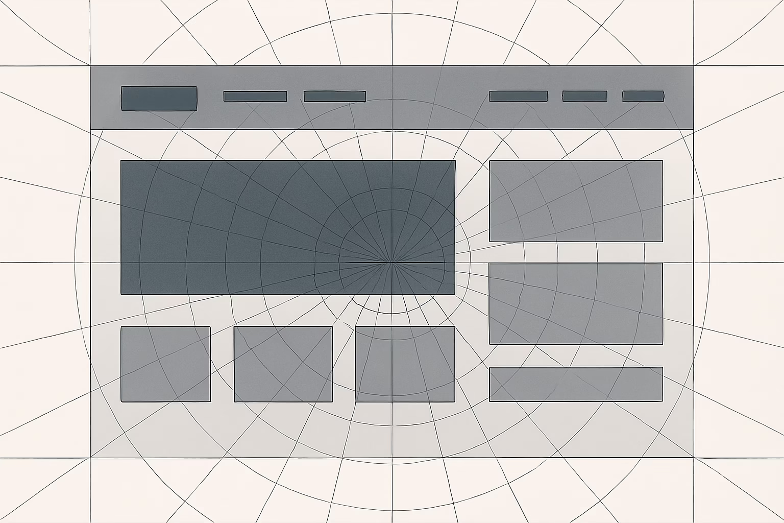
Creating Scalable Templates in Framer
Designing scalable templates isn’t just about having a great idea—it’s about implementing strategies that allow your design to flex and adapt. Here’s how you can do it:
1. Plan Your Layout
- Start with Wireframes: Sketch out different states of your template for various devices. Consider how elements should reposition or resize.
- Define Clear Sections: Break your design into logical sections (e.g., header, body, footer) that can be managed independently.
2. Utilize Auto Layout and Grid Systems
Auto Layout:
Use Framer’s auto layout to automatically adjust components. For example, when you add text or images to a card, auto layout can maintain padding and spacing consistently.Grids:
Implement grid structures to ensure that all elements align properly. A well-planned grid system makes it easier to scale your design across different resolutions.
3. Build Reusable Components
Create Components:
Design core elements—like buttons, cards, and forms—as components. This allows you to reuse them in different parts of your template without reinventing the wheel.Apply Variants:
Use Framer’s variant feature to design multiple states (e.g., hover, active, disabled) within one component. This maintains consistency and reduces complexity in your template.
Ensuring Responsiveness in Framer
Responsive design is at the heart of modern UX. Here’s how to make your Framer templates responsive:
1. Set Responsive Constraints
Flexible Dimensions:
Assign relative sizes to elements rather than fixed dimensions. This lets elements flex naturally as the viewport changes.Responsive Breakpoints:
Define breakpoints to automatically adjust layouts. For instance, on smaller screens, navigation elements might stack vertically instead of remaining side-by-side.
2. Test Across Devices
Preview in Framer:
Use Framer’s preview mode to see how your template behaves on different devices. Check for alignment, spacing, and readability.Iterate Based on Feedback:
Incorporate user feedback and testing insights to refine your templates. Validate that every component remains functional and legible across various screens.
Best Practices and Tips
Maintain Consistency:
Keep a consistent style guide—fonts, colors, and spacing are crucial for unified design language.Document Your Components:
As you build a library of reusable components, document their usage. This helps both you and your team maintain consistency in future projects.Stay Updated:
Framer regularly introduces new features. Stay engaged with the community and explore tutorials to discover best practices in leveraging these updates.Mix Code with Design:
If you’re comfortable with code, integrate Framer’s code features to add extra layers of flexibility and customization to your templates.
Final Thoughts
Using Framer for scalable and responsive design templates empowers designers to iterate quicker and produce consistent, user-friendly designs across various devices. From harnessing auto layout to leveraging responsive breakpoints, mastering these techniques ensures that your designs remain future-proof and adaptable.
Got questions on a specific Framer feature or need tips for troubleshooting responsive issues? Drop your thoughts in the comments or reach out directly—we’re always here to explore creative solutions with you.
Additional Resources
- Framer’s Official Tutorials: Explore Framer
- Design Systems: Look into design systems like Material Design or Carbon Design System for inspiration on scalable components.
- Responsive Design Articles: Check out articles on Smashing Magazine and CSS-Tricks for deeper insights into responsive practices.
What scalable template are you most excited to build in Framer? Or are there other Framer tips you’d love to learn more about? Let’s keep the conversation going—happy designing!

