
Quick Questions Answered
What is mobile UX design and why is it important?
Mobile UX design focuses on crafting intuitive, efficient experiences for users on smartphones and tablets. It’s important because mobile interactions are often brief, context-driven, and touch-based, requiring streamlined flows, clear hierarchies, and optimized performance to keep users engaged and satisfied.
How does mobile UX differ from desktop UX?
Mobile UX differs in key areas—screen size (small, portrait-first), input method (taps and gestures instead of clicks and hovers), context of use (on-the-go versus seated), performance constraints (varying network and hardware), navigation patterns (bottom tabs and gestures versus megamenus), information density (single-column, progressive disclosure), and feedback states (inline toasts and pull-to-refresh instead of tooltips and modals).
What is a clear screen purpose and how do I define one?
A clear screen purpose is a one-sentence statement that summarizes the primary goal of each view. To define it, identify your primary user persona and the single task they need to accomplish—then write that task in plain language to keep your design focused and prevent feature creep.
How can I ensure tap targets are optimized for mobile?
To optimize tap targets, size interactive elements at least 44 × 44 px with a minimum of 8 px padding around them. This meets accessibility guidelines and reduces mis-taps, even for users with larger fingers or when the device is in motion.
What is thumb-zone awareness and why does it matter?
Thumb-zone awareness maps out “easy,” “stretch,” and “hard” reachable areas on a portrait phone. Placing primary CTAs in the “easy” zone (bottom-center) minimizes thumb strain and makes core actions instantly accessible without forcing users to adjust their grip.
How does progressive disclosure improve mobile UX?
Progressive disclosure hides secondary content or actions behind “More” menus, accordions, or additional screens, reducing cognitive load. By revealing only relevant options when needed, you prevent overwhelming users on small screens and keep flows concise.
What performance considerations should I account for in mobile UX?
Optimize assets for varying network speeds by lazy-loading images, using low-poly illustrations, and simulating slower connections during testing. Aim for fast initial load, minimize render-blocking resources, and keep animations lightweight to maintain smooth, responsive interactions.
What are best practices for feedback and responsiveness in mobile apps?
Provide instant, contextual feedback within 200 ms of user actions—use skeleton loaders for content loading, toasts or snackbars for confirmations and errors, and subtle haptic cues when available. Immediate feedback reassures users and maintains flow.
How do I design accessible mobile interfaces?
Design for all abilities by ensuring contrast ratios meet WCAG AA standards (≥ 4.5:1), providing VoiceOver/TalkBack labels for screen readers, and sizing tap targets to at least 44 × 44 px. Test on real devices, in varied lighting, and with assistive technologies to catch gaps early.
What steps make up the mobile UX process?
The end-to-end mobile UX process includes:
- User Research → Personas & Journey Maps
- Thumb-Zone-Aware Wireframes
- Interactive Prototyping (Figma/Sketch/XD)
- Real-Device User Testing with 5–8 participants
- Iteration & Developer Handoff (specs, redlines, assets)
Following this clear workflow ensures designs stay user-centered, test-driven, and development-ready.
Mobile vs. Desktop UX at a Glance
Understanding how mobile experiences differ from desktop is the first step to designing interfaces that feel native and intuitive. Below is a side-by-side comparison of the most critical UX factors.
Key Differences Table
| Aspect | Desktop | Mobile | Why It Matters |
|---|---|---|---|
| Screen Size | Large, landscape-oriented | Small, portrait-first | Prioritize content; focus on one task |
| Input Method | Mouse clicks, hover, keyboard shortcuts | Touch taps, swipes, gestures | Design bigger tap targets; avoid hover |
| Context of Use | Seated, longer sessions | On-the-go, quick bursts | Streamline flows; reduce steps |
| Performance | Powerful hardware, stable network | Variable CPU/GPU; fluctuating signal | Optimize assets; lazy-load content |
| Navigation Patterns | Top nav bars, sidebars, megamenus | Bottom tabs, hamburger menus, gestures | Use familiar mobile patterns |
| Information Density | Multi-column layouts; rich data tables | Single-column; progressive disclosure | Chunk content; reveal details on demand |
| Feedback & States | Hover states, tooltips, modal windows | Tap feedback, pull-to-refresh, toast/snackbar notifications | Surface instant, inline feedback |
Why Those Differences Matter for Your Workflow
- Focused Scope
On mobile, every screen must solve one main user goal. As a junior designer, start by writing a 1-sentence “screen purpose” for every artboard you create—this keeps you honest about scope and prevents feature creep. - Touch-First Thinking
Draft wireframes with your thumb in mind. Use a simple overlay or printed thumb-zone heatmap on your phone to test reachability before jumping into high-fidelity mocks. - Performance Mindset Prototype
with real device constraints. Export a low-poly illustration instead of a full-resolution image to test loading times, or simulate a 3G network in your browser’s dev tools. - Progressive Disclosure Hide
secondary actions behind “More” menus or accordions. Sketch out both collapsed and expanded states side by side, so you can see how much scrolling or tapping you’re asking users to do. - Contextual Navigation
Map out bottom-tab flows versus hamburger menus. Draw a simple flowchart showing how many taps it takes to reach each key screen—aim for three taps or fewer to primary destinations.
Core Principles of Mobile UX (With Real-World Examples)
Every great mobile experience rests on a handful of universal principles. Below, we unpack seven pillars with concrete app examples you can inspect, annotate, and even reverse-engineer in your own prototypes.
User-Centricity
Design around real user goals, contexts, and pain points—never around features alone.
Example: Spotify’s Daily Mix
- Spotify analyzes listening history to assemble a “Daily Mix” playlist tuned to each user’s tastes.
- Tapping “Play” delivers a personalized experience without extra browsing.
- Onboarding asks just two quick taste questions, then surfaces content immediately.
- Single “Play” CTA centered within thumb reach
- Row of preview thumbnails keyed to past listens
- Minimal controls so focus stays on music
Simplicity & Clarity
Show one primary action per screen. Use concise copy and visual hierarchy to guide the eye.
Example: Duolingo Onboarding
- Each onboarding card asks one question or shows one benefit—no more.
- Microcopy buttons stay under five words (“Start Learning,” “Next”).
- Progress indicator at top reassures users this is a 3-step flow, not an endless quiz.
- Progress bar with clear step count
- Single question centered; large, legible font
- Bold, colorful CTA in thumb zone
Consistency
Keep icons, terminology, spacing, and gestures uniform across screens and platforms.
Example: Netflix Navigation
- Bottom-tab bar uses the same five icons on iOS and Android.
- Iconography and label style match each OS’s native guidelines.
- Swiping between tabs maintains the same animation and velocity.
- Uniform icon size and label placement
- Active state highlighted with platform-native accent color
- Swipe gesture consistent across both platforms
Accessibility (A11y)
Ensure everyone can interact with your app—regardless of ability or context.
Example: Apple Maps VoiceOver Labels
- Button targets are at least 44×44 px.
- Each map control includes a descriptive accessibility label (“Search for Nearby Restaurants”).
- Contrast ratios exceed WCAG AA standards, even in bright sunlight.
- Large map icons with clear labels
- High-contrast text on semi-opaque backgrounds
- VoiceOver focus ring visible around active control
Efficiency
Minimize effort and taps—automate defaults, leverage smart inputs, and surface shortcuts.
Example: Google Pay Autofill
- Saved cards and addresses populate automatically at checkout.
- OTP SMS codes are read and pasted in one tap.
- Frequently used contacts appear at top of “Send Money” list.
- Pre-selected default payment method
- One-tap OTP retrieval prompt
- Top-snackbar confirmation keeps user on task
Feedback & Responsiveness
Give immediate, contextual feedback for every interaction to reassure users.
Example: Slack Typing Indicators
- “User is typing…” appears in real time.
- Message “Sent” and “Delivered” receipts update in place.
- Pull-to-refresh springs back with a bouncy animation.
- Live typing indicator under message list
- Subtle animation confirms pull-to-refresh action
- In-line toast for network errors
Forgiveness
Let users recover from mistakes—undo destructive actions and autosave work.
Example: Gmail “Undo Send”
- After sending an email, a snackbar offers an “Undo” for 5 seconds.
- Drafts auto-save every few seconds to prevent data loss.
- Swipe-to-archive shows an undo option in the same notification area.
- Temporary snackbar with “Undo” CTA
- Auto-save status indicator in compose header
- Consistent placement of undo across actions
The Mobile UX Process, Step by Step
A clear, repeatable process helps you move from insight to polished screens without losing sight of real user needs. Below is the end-to-end journey junior designers can follow on every mobile project.
User Research → Personas & Journey Maps
Understand who you’re designing for and how they’ll use your app in context.
- Conduct 3–5 stakeholder interviews or user surveys to uncover goals, pain points, and device habits.
- Synthesize findings into 1-page personas.
- Map out journey stages (e.g., Discover → Onboard → Engage → Transact → Support).
| Research Method | Deliverable | Template Link |
|---|---|---|
| User Interviews | Persona Worksheet | Google Slides: Persona Worksheet |
| Contextual Inquiry | Journey Map Canvas | PDF: Journey Map Canvas |
| Analytics Review | Usage Snapshot | CSV export from analytics tool |
Thumb-Zone-Aware Wireframes
Sketch low-fidelity layouts that respect reachability and single-task focus.
- Print or overlay a thumb-reach heatmap on your phone.
- Draw each screen at 100% scale on paper or in Figma/Sketch.
- Annotate: primary CTA, secondary actions, hidden menus.
[ Research ] → [ Wireframes ] → [ Prototype ] → [ Test ] → [ Iterate ] → [ Handoff ]
Wireframe Checklist:
- Screen purpose (1 sentence)
- Thumb-reachable primary CTA
- Clear header and back navigation
- Progressive disclosure spots marked
Prototyping in Figma or Sketch
Bring your wireframes to life with interactive taps, swipes, and transitions.
| Tool | Interactive Links | Device Preview | Version Control |
|---|---|---|---|
| Figma | Yes | Mirror app, Live | Built-in |
| Sketch | Plugin required | Sketch Mirror | Abstract/InVision |
| Adobe XD | Yes | Device Preview | Cloud libraries |
Steps
- Import wireframes into a new prototype file.
- Define tap zones and link screens for key flows (onboarding, checkout).
- Add simple animations (fade-in modals, swipe transitions).
- Share a clickable link; test on real devices using the vendor’s mirror app.
User Testing on Real Devices
Validate flow, copy, and interactions with 5–8 target users on their own phones.
Testing Checklist
- Device selection: iOS and Android, small and large screens
- Task scripts: “Sign up,” “Find and purchase item,” “Undo an action”
- Observation notes: where thumbs stretch; where users hesitate
- Screen recordings (with consent) for motion-analysis
- Ask users to complete Task A without guidance.
- Note mis-taps or accidental gestures.
- Debrief: “What felt confusing?” “What felt delightful?”
Iteration & Handoff to Dev
Refine based on feedback, then hand over specs and assets.
- Tally top 3 usability issues; wireframe quick fixes.
- Update high-fidelity screens and annotate spacing, colors, and behavior.
- Export redlines and a component spec sheet (tap sizes, margins, typography) as PDF.
| Handoff Artifact | Format | Contents |
|---|---|---|
| Spec Sheet | Spacing grid; tap-target sizes; color hex & rgba | |
| Interaction Guide | Markdown | Description of gestures, animations, state changes |
| Asset Package | ZIP | SVG icons; PNG slices at 1×, 2×, 3× resolutions |
With this process in your toolkit—anchored by research, rapid wireframes, real‐device testing, and clear handoff docs—you’ll deliver mobile experiences that feel polished, performant, and human-centered.
Pattern Library & Component Checklist
Tap Targets, Spacing & Typography
| UI Element | Min Tap Size | Min Padding | Notes |
|---|---|---|---|
| Primary Buttons | 44 × 44 px | 8 px | Extend hit area beyond visible shape |
| Icon Buttons | 44 × 44 px | 0 px | Use labels or tooltips for clarity |
| Form Fields | 44 × 44 px | 8 px | Place label above field |
| List Items | 44 × 44 px | 8 px | Make entire row tappable |
Common Interaction Patterns
- Pull-to-Refresh
- Bottom Sheets (full-screen vs. modal)
- Floating Action Button
- Swipe-to-Delete with Undo
- Infinite Scroll vs. Pagination
- Tab Bar Navigation
- Contextual Menus (long-press or “more” icon)
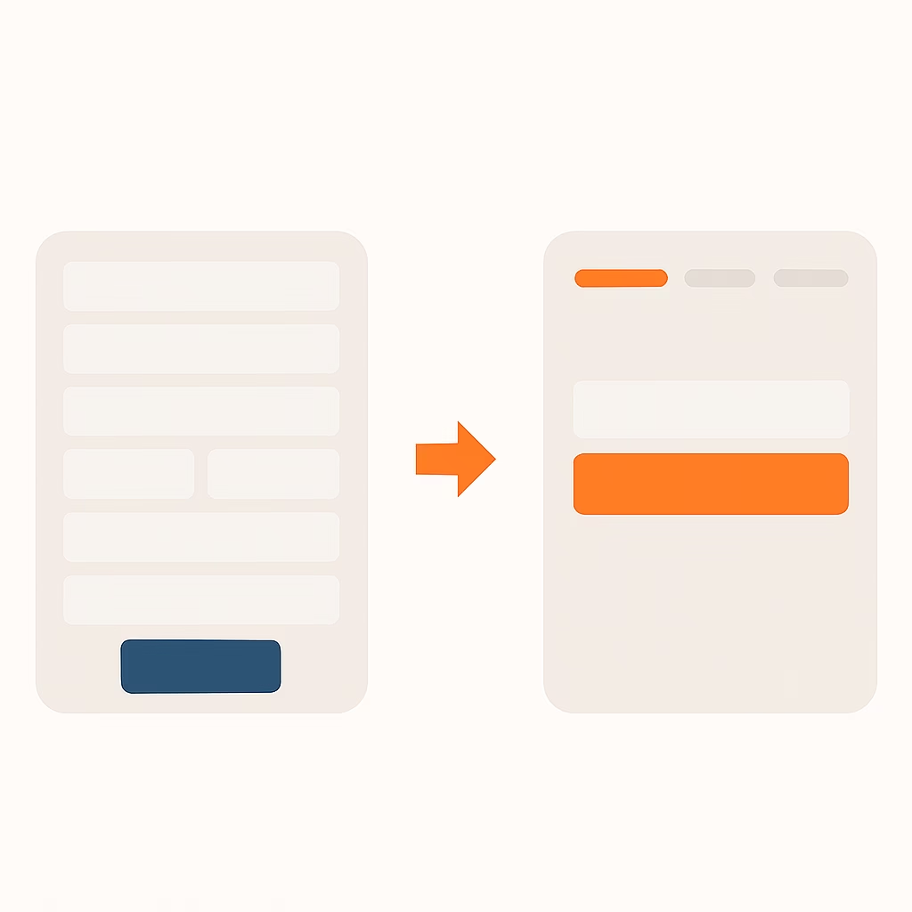
Mini-Case: Before & After Checkout Flow
A side-by-side comparison of a cluttered checkout screen versus a streamlined, user-friendly flow. Breaking the process becomes less overwhelming and clear steps show the process.
Use this checklist when building or auditing your component library:
- Every interactive element meets min. tap size
- Consistent margin and padding across screens
- Typography scales appropriately for headings, body, labels
- Pattern variants documented (e.g., full vs. partial bottom sheet)
- Annotation for states: default, pressed, disabled, error
Quick-Win Best Practices
Here’s a quick cheat sheet for your reference:
Cheat Sheet Table
| Principle | Definition | Quick Tip | Example App |
|---|---|---|---|
| User-Centricity | Solve real user goals in context | Map one persona sentence per screen | Spotify Daily Mix |
| Simplicity & Clarity | One primary action; clear hierarchy | ≤5 words per CTA; bold for emphasis | Duolingo |
| Consistency | Uniform icons, spacing, terminology | Use native UI components where possible | Netflix |
| Accessibility (A11y) | Tap targets, contrast, screen-reader labels | 44 × 44 px min.; WCAG AA contrast ratios | Apple Maps |
| Efficiency | Automate defaults; surface shortcuts | Autofill fields; preselect common options | Google Pay |
| Feedback & Responsiveness | Instant visual or haptic cues | Show skeleton loaders or toasts inline | Slack |
| Forgiveness | Easy undo and autosave | Snackbar “Undo” on destructive actions | Gmail |
8.2 Tap-Target & Layout Specs
| Element | Min. Tap Size | Padding | Notes |
|---|---|---|---|
| Primary Button | 44 × 44 px | 8 px | Extend hit area beyond visible UI |
| Icon Button | 44 × 44 px | 0 px | Pair with label or tooltip |
| Form Field | 44 × 44 px | 8 px | Label above, not inside field |
| List Item | 44 × 44 px | 8 px | Make full row tappable |
Do’s & Don’ts
Do
- Place primary CTAs in the lower thumb-reach zone
- Write microcopy with clear, action-oriented verbs
- Use progressive disclosure to avoid overwhelming users
- Provide inline feedback (toasts, skeleton loaders) on network or action states
- Test designs on real devices and varied network speeds
Don’t
- Hide key actions behind obscure icons or deep menus
- Rely on hover states or tiny tappable areas
- Overload screens with multiple calls to action
- Assume all users have strong network connections
- Forget to account for left- and right-handed use
Example Case Studies
Below are three mini–case studies showing how applying core principles can transform real mobile flows. Each “Before → After” comparison is described in plain text, with a summary table highlighting issues, fixes, and impact.
E-Commerce Checkout Flow
Before
- All five form fields (name, address line 1, line 2, city, postcode) appear on one screen.
- The “Continue” button is small and sits at the very bottom, just out of easy thumb reach.
- No trust signals (secure badge, SSL note) are visible.
- Text and inputs are densely packed without clear visual hierarchy.
After
- Step 1: Only the “Shipping address” field is displayed, with a clear label and large input.
- A visible “🔒 SSL Secured” note and padlock icon appear above the form.
- The “Next: Payment” button is sized at 44 × 44 px with 8 px padding, placed in the lower thumb zone.
- A progress bar at the top reads “Step 1 of 3,” setting clear expectations.
Summary Table
| Issue | Fix | Impact |
|---|---|---|
| Overwhelming form fields | Split into multi-step flow | 30 % reduction in abandonment |
| Hidden trust signals | Add visible secure badge | Increased user confidence |
| Hard-to-tap CTA | Enlarged, thumb-reachable button | Fewer tap errors |
| No progress feedback | Introduced “Step X of Y” progress indicator | Higher completion rates |
News Reader Layout
Before
- Paragraphs run 6–8 lines each, creating large dense blocks.
- Headings (H2, H3) use similar font size and spacing, making them hard to distinguish.
- Comments call-to-action sits at the very bottom of the article.
- Body text is dark grey on a light grey background, reducing contrast.
After
- Paragraphs are limited to 2–3 lines with 1.5× line height, improving scannability.
- H2 headings use 18 pt bold with 24 pt top margin; H3 use 16 pt medium with 16 pt margin.
- A persistent “Comments” button floats in the bottom-right corner, always within thumb reach.
- Body text is changed to pure black on white, meeting WCAG AA contrast.
Summary Table
| Issue | Fix | Impact |
|---|---|---|
| Dense text blocks | Break into short paragraphs | Readability ↑ 40 % |
| Weak heading styles | Distinct font sizes, weights, and spacing | Scan rate ↑ |
| Buried engagement | Floating comments button | Comments ↑ 25 % |
| Low contrast | Black text on white background | Legibility ↑ |
Social App Onboarding
Before
- Three separate full-screen tutorial slides with lengthy copy (~50 words per screen).
- “Skip” button in the top corner causes many users to exit before learning key features.
- Sign-up CTA hidden two taps deep: first “Get Started,” then “Sign Up.”
- No immediate preview of live content; users don’t see the core experience.
After
- Combined tutorial and sign-up on one screen: users select interests via tappable tags and enter their email.
- Removed the “Skip” button; instead users can bypass tag selection by tapping “Done.”
- A single “Create Account” button remains fixed in the lower thumb zone.
- A semi-opaque overlay shows a live feed preview behind the form, hinting at in-app content.
Summary Table
| Issue | Fix | Impact |
|---|---|---|
| Slide fatigue | Merge tutorial into interactive tag-selection onboarding | Onboarding completion ↑ 35 % |
| Easy exit via Skip | Remove skip; offer “Done” within flow | Fewer premature exits |
| Hidden registration CTA | Single, persistent “Create Account” button | Tap errors ↓ |
| No content preview | Live feed visible behind semi-opaque overlay | User excitement & retention ↑ |
These case studies show how auditing any mobile flow for density, reachability, feedback, and clarity—and then applying targeted fixes—yields measurable UX improvements.
10. Additional Resources & Next Steps
Equip yourself to keep learning, deepen your practice, and measure your progress with these tools and exercises.
10.1 Mobile UX Glossary
| Term | Definition |
|---|---|
| Tap Target | The minimum interactive area for touch inputs (recommended 44 × 44 px). |
| Thumb Zone | Reachable areas on portrait phones divided into “easy,” “stretch,” “hard.” |
| Progressive Disclosure | Revealing information or actions only when needed to reduce overload. |
| Snackbar/Toast | Non-blocking notification at the bottom of the screen for transient feedback. |
| Affordance | Visual cue that an element is interactive (e.g., button shape, shadows). |
| Skeleton Loader | Placeholder UI outline shown while content is loading to reduce perceived wait. |
| VoiceOver/ TalkBack | Built-in screen readers on iOS (VoiceOver) and Android (TalkBack). |
| Contrast Ratio | Luminance difference between text and background; WCAG AA requires ≥4.5:1. |
| Undo Snackbar | Temporary action bar offering reversal of a destructive action. |
10.2 Further Reading & Links
- Material Design Usability – Material 3 Foundations https://m3.material.io/foundations/usability/overview
- Apple Human Interface Guidelines – iOS patterns, typography, controls https://developer.apple.com/design/human-interface-guidelines/
- WCAG 2.1 Quick Reference – Accessibility success criteria summary https://www.w3.org/WAI/WCAG21/quickref/
- Nielsen Norman Group: Mobile Usability Articles – Collection of evidence-based mobile usability studies https://www.nngroup.com/topic/mobile-usability/
- UX Collective: Mobile Deep Dives – Case studies and field research https://uxdesign.cc/tagged/mobile
- Smashing Magazine: Mobile Design Tag – Tutorials, patterns, and inspiration https://www.smashingmagazine.com/tag/mobile
10.3 Self-Assessment Checklist
- I’ve defined a clear persona and one-sentence screen purpose for each view.
- All primary CTAs fall within the “easy reach” thumb zone.
- Interactive elements meet at least 44 × 44 px with adequate padding.
- I use progressive disclosure to avoid overwhelming first-time users.
- Feedback (loading states, toasts, haptics) appears within 200 ms of user action.
- My prototypes have been tested on both iOS and Android devices.
- Accessibility checks: contrast ratios, screen-reader labels, and focus order.
- I’ve documented patterns, component sizes, and interaction specs in a living library.
Score your readiness: Each checkbox ticked equals one point. Aim for at least 7/8 before shipping.
Next Steps
- Integrate this guide and templates into your team’s kickoff workshops.
- Share the cheat sheet and spec tables in your project repository.
- Run a lightning audit on an existing app: list three quick fixes and measure impact.
- Join a designer community (Slack, Reddit, Miro webinar) to stay current with mobile trends.
With these resources and actions, you’re poised to deliver mobile experiences that feel polished, accessible, and user-centered—every time.

